Design That Saves Lives: The New Codaco UI
6/26
Hospital communication must be one hundred percent fast and clear. Every second counts. A major contributor to this is the Czech nurse call system by Codaco Electronic, a company based in Valašské Meziříčí. If you have ever stayed in a hospital, there is a high probability that you used their equipment to call for help.
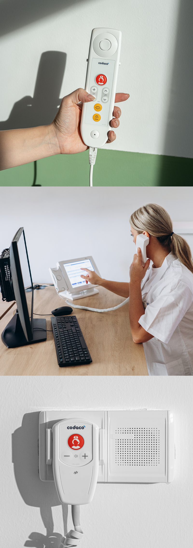
Our task at Divan Design was to breathe a new, modern, and highly organized face into this successful system. We designed the user interface (UI) for the entire hardware range – from handsets, sensors, and alarms to chip-based elements used to register staff presence at the patient’s bedside.
Ergonomics and Visual Order
We preserved the original, technically proven 3D construction of the elements. However, we focused fully on ergonomics, perfect readability, and the visual unity of the control overlays. A key challenge was a completely new icon system that enhances intuition in crisis situations. Furthermore, we newly linked the graphics of the physical products with the digital interface on the displays.
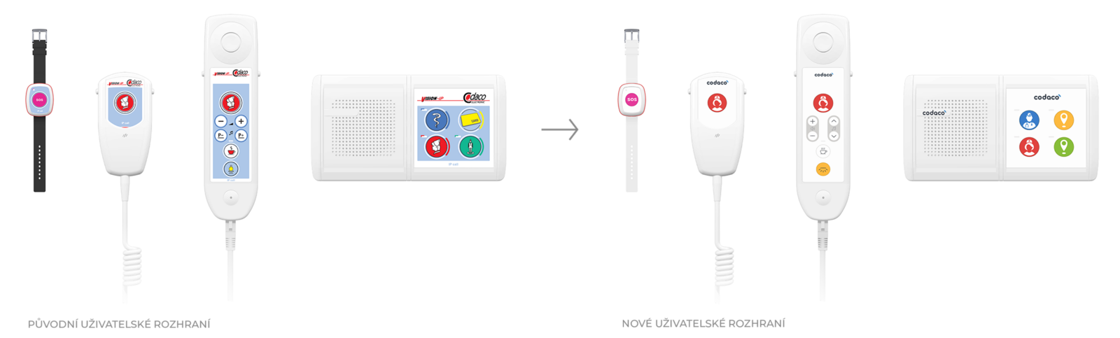
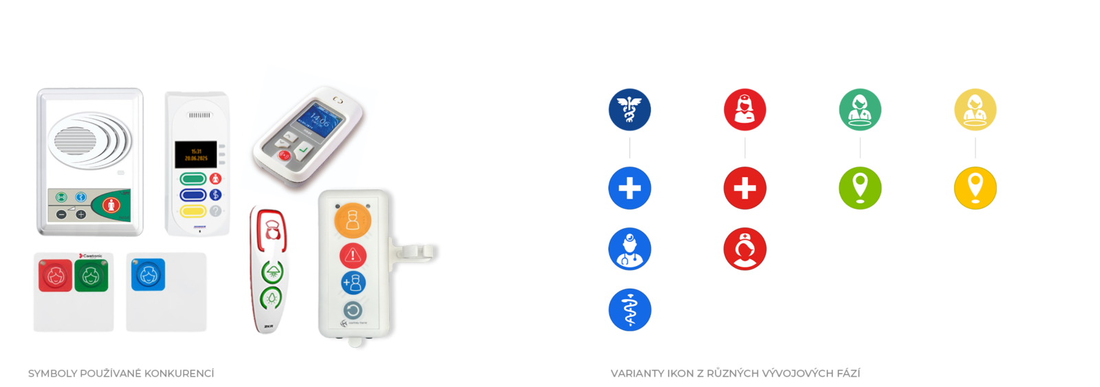
In the images below, you can see a “before” and “after” comparison, the considered icon variants for calling a doctor, and examples of complicated competitor systems.
Looking at the competition reveals the greatest pitfall of today’s interfaces. The problem is rarely a ignorance of theory, but rather the wild variety, ambiguity, and clutter of the different icon variations existing on the market. When every manufacturer interprets the same function differently, visual noise is created. To bring clear order to this chaos, we had to go back to the pure basics of how icons and symbols actually work in the human mind.
5 Rules for a Functional Interface (Not Only) in Healthcare
Icons and symbols are visual shortcuts. Their purpose is to convey meaning in a flash without the need to read text. To ensure they work correctly, we adhere to these principles:
- The Icon as a Visual Metaphor
An icon represents a specific, real object. The brain immediately connects it with a function – just like when you see a shopping cart on an e-shop or a folder on your computer. A successful icon relies on our shared experience. - The Symbol as a Cultural Convention
A symbol is abstract. It has no direct link to a physical object – its meaning is something we, as humanity, had to learn. Examples include the three horizontal lines for “menu” (the hamburger menu), the power button, or traffic signs. They only work when they are universally established. - Semantic Consistency
The visual appearance must correspond one hundred percent to the function and be repeated consistently across the entire system. Any inconsistency in iconography leads to frustration and errors for fatigued staff. - Mind the Cultural Context
Meanings are not universal. For instance, a mailbox or an envelope for e-mail works in the Western world, but might miss the mark elsewhere. For global products, we avoid overly specific or historically conditioned metaphors. - Text as a Helping Hand
When a user is first getting to know a new interface, it helps if the icon is accompanied by a short label. Once the meaning becomes automated, the text becomes redundant, and the brain reacts purely to shape and color.
Do You Know What Colour-Coding and the “Snake” Catch Are?
Color as the Primary Driver: Color coding (driven by standards and habit) is often stronger than the shape itself. The right color guides the human eye to its target even before the brain manages to recognize the pictogram.
One Snake, or Two? A huge mistake keeps popping up over and over again in medical design: confusing the Rod of Asclepius with the Caduceus. The correct symbol for medicine is the Rod of Asclepius with a single snake. The Caduceus (with two snakes and wings) is historically a symbol of commerce and diplomats. As such, it has no place in a hospital.
When designing for Codaco Electronic, we transformed all these theoretical layers into a clean, minimalist design. Because the seconds a nurse saves thanks to an intuitive button can mean a great deal in a hospital environment.